What is life like for people with a visual impairment? How do they access information, especially via digital channels? And how do they navigate websites? In a recent project, we analysed how accessible the ZHAW’s webpages are for visually impaired people, incorporating a usability approach in the process. Recognising that stand-alone accessibility measures are insufficient, we combined accessibility with usability to achieve an inclusive design for information products, including websites.
By Birgit Fuhrmann, Martin Schuler and Dario D’Agostino
How do visually impaired people navigate the Internet and gather information? First of all, there are guidelines for the grading of visual impairment based on the remaining visual acuity of the individual in question [1]. In our project, we worked with visually impaired people with remaining visual acuity of:
- more than 30%, classified as a visual function restriction,
- 30% to 5%, classified as a visual impairment,
- 5% to 2%, classified as a high visual impairment,
- and less than 2%, constituting blindness.
Depending on the grade of their visual impairment, people use different hardware and software to access the Internet. In terms of hardware, laptops and smartphones are used to access desired webpages. Affected individuals also have supplementary software installed on their devices to help them search and navigate.
Visually impaired people who struggle with contrast employ apps with specialised functions for zooming and colour inversion. Conversely, many blind people use so-called screen readers that render text and image content as speech or braille output to assist users with navigation. Others use programs that combine zooming and screen reading functionalities. These examples demonstrate the wide variety of tools being used. Most tools share additional search features that tap into HTML information such as headings, navigation items and links, aiding users in locating necessary information. For this reason, the format and layout of the webpages have to be well structured, clear and consistent. Otherwise, navigating with zoom or a screen reader is virtually impossible, as the necessary anchors are missing.


The project: accessibility of ZHAW webpages
Prior to our project, the ZHAW initiated an ICT-based assessment of its webpages on behalf of the President’s Office. This assessment was subsequently conducted by the LAIC Lab. The ICT Accessibility Lab evaluated the compliance of the webpages with the Web Content Accessibility Guidelines (WCAG 2, in German). While ICT testing delivers crucial and reliable results, we contend that only web users themselves can judge the accessibility of a website.
Funded by the Digital Futures Fund, we therefore resolved to evaluate the accessibility and usability of our webpages. We were eager to find out the following:
- How accessible our webpages are for visually impaired users.
- The benefits of usability testing, which is not a commonly applied method in this field.
- The benefits of the direct involvement of actual web users.
- The requirements of visually impaired participants during testing.
- Necessary adaptations to research processes, employing usability as a method.
It is worthy of note that conducting research in collaboration with visually impaired people, rather than merely researching „about“ them, was a pivotal perspective that we prioritised.
Needs of visually impaired people
Several participants acknowledged that our webpages are superior to others and on the right path. However, we identified substantial potential for optimisation across six categories, namely with respect to the search function, navigation, structure, site design, continuing education and an app.
- Regarding the search function, users found it inconvenient, as it requires two clicks to activate and enter a search term. In contrast, most Internet search functions only require a single click. This caused confusion and also resulted in time being lost. We would therefore highly recommend changing this aspect.
- Concerning structure, we noted that multiple headings on a single page were formatted using heading level 1 (main heading). This posed a problem, as the primary heading holds pivotal importance in terms of providing an overview and aiding navigation. Having multiple main headings means that users need to search through them in order to find core content, leading to confusion and time being lost. We propose that this aspect is optimised by making the level 1 heading (i.e. the webpage title) prominently consistent at the page’s outset and that level 1 headings are limited to one occurrence per page.
- In terms of navigation, we observed difficulties with respect to keyboard operation in instances in which users needed to use the tab and enter keys to open and navigate menus. This was not in keeping with the users‘ expectations, as the up and down arrow keys are more commonly used for menu navigation. We suggest that both methods are enabled in order to provide flexibility as regards keyboard operation.
Following our research, we engaged in a discussion with the President’s Office in which we shared our recommendations for webpage optimisation and the integration of usability testing into future developments with the goal of enhancing accessibility and usability for visually impaired people.

Key takeaways for everyday life
Beyond our findings, we also yielded significant insights into implementing usability testing with the involvement of visually impaired people. Initially, we became aware of the diverse nature of visual impairments. Common perceptions often revolve around canes or guide dogs for the visually impaired. However, there are guidelines for the grading of visual impairments, with different grades requiring different tools to assist affected individuals in navigating and accessing webpages. We recognised that we too had preconceptions about visually impaired people.
Lessons learned for research and usability testing
Inclusive research projects present an ongoing challenge for researchers, as the field is not yet well-equipped for such endeavours. Adjustments are needed to accommodate inclusivity in light of the fact that conventional research methods and procedures may fall short in this regard. We confronted this challenge in our project, garnering insights for future projects.
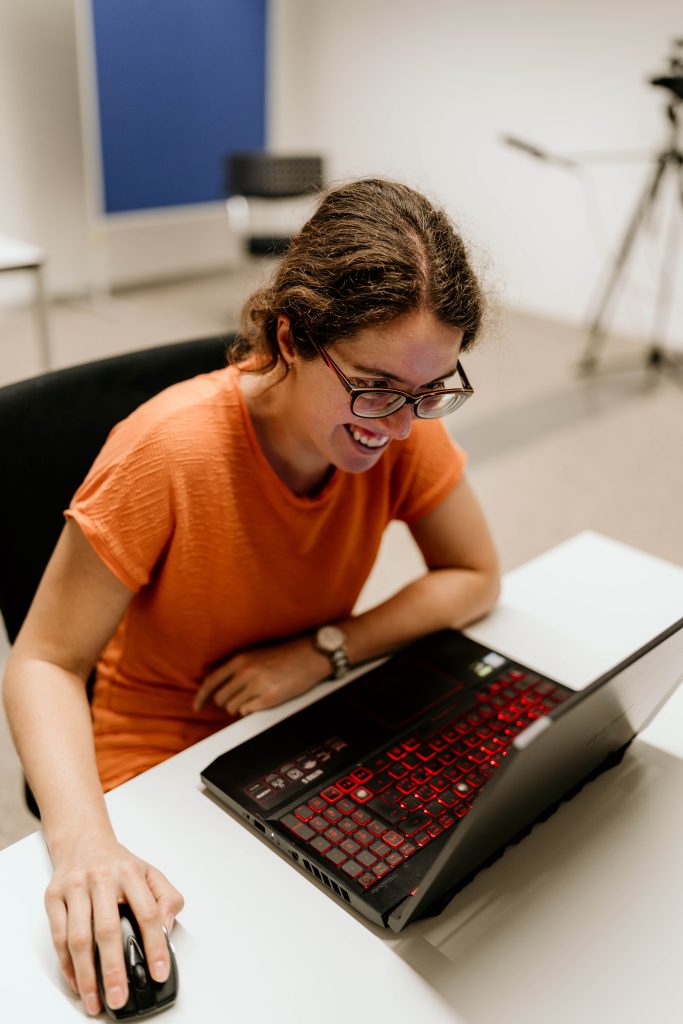
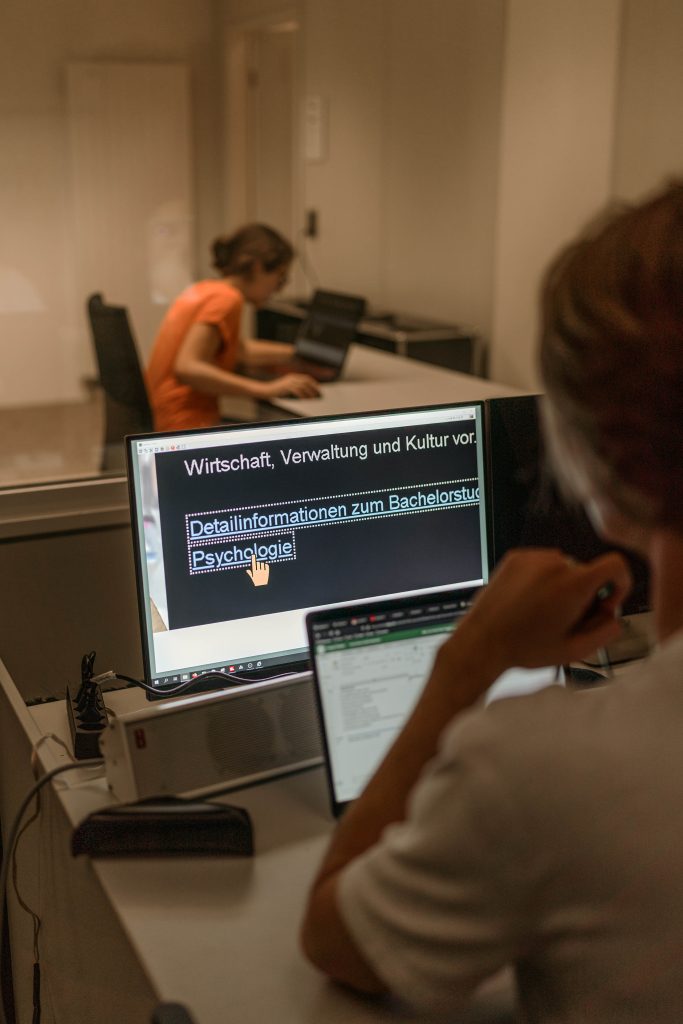
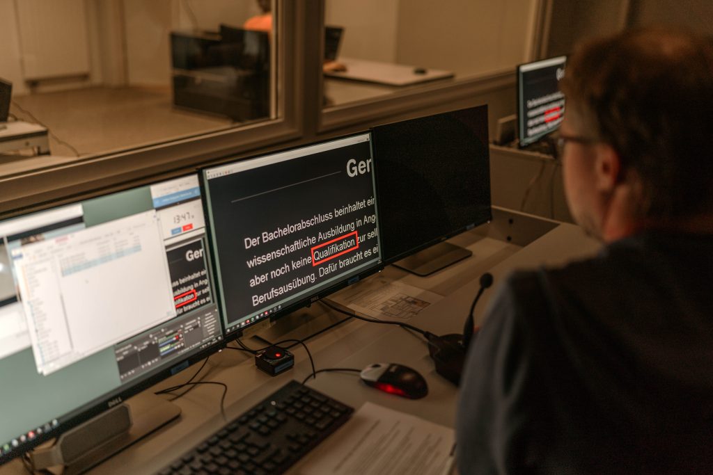
For instance, our usability lab is physically accessible. However, this is one of the simplest modifications. Planning and recruiting test participants necessitates greater empathy and a deeper level of knowledge about the testing group. In this way, potential pitfalls can be anticipated and prevented, facilitating smoother testing in the process. Our test settings were thus individually tailored to the needs of each participant, accommodating variations such as the use of personal devices and specific apps during the testing process. This approach minimised friction during the completion of tasks on the websites.
Generally, traditional usability testing methods strictly specify that the test leader should not intervene during the testing process. However, this was unfeasible as part of our inclusive testing, meaning we adopted a coaching approach that involved questioning and hints from the project team.
Research WITH visually impaired people
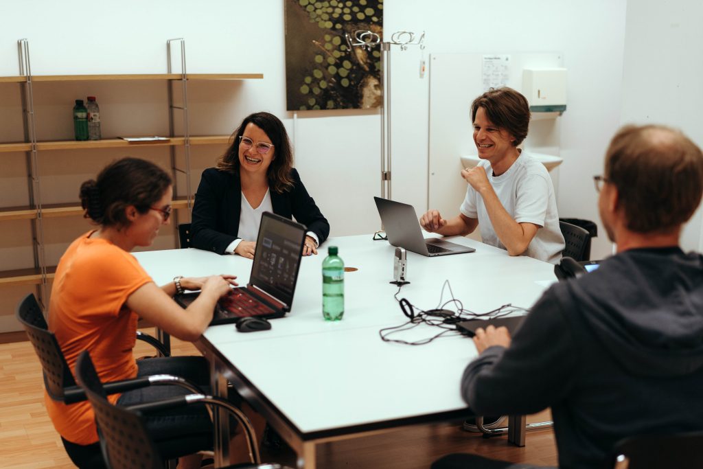
Crucially, we acknowledge that we could not have undertaken this project on our own. We would like to extend our immense gratitude to the organisations that support visually impaired people and who assisted us in recruiting participants by distributing our communications. We would also like to thank all of the participants who invested their time in visiting our lab and contributing to our tests.
“I am very grateful for the opportunity to meet these resilient, patient and admirable people who participated in our project. This experience also highlighted the challenges found within today’s web infrastructure and the necessity for inclusive web design. Hopefully, our findings will promote awareness and provide impetus for the creation of more inclusive websites”, remarked Birgit Fuhrmann. These lessons learned will guide us in future projects conducted within this research area. We are eager to share our findings and insights with fellow researchers and practitioners, allowing us to contribute to a better and more inclusive world.
And it shouldn’t be forgotten: access to information and communication technologies and systems is a human right
In 2006, the United Nations adopted the Convention on the Rights of Persons with Disabilities, advocating for inclusivity across personal and professional spheres. Article 9 of this convention emphasises accessibility in information and communication technologies, including webpages. In 2014, Switzerland ratified these conventions, committing to observe their principles. However, considerable strides can still be made to bolster accessibility.
References
[1] Lang, M., Heyl, V. (2020): Pädagogik bei Blindheit und Sehbehinderung. Stuttgart: W. Kohlhammer Verlag

The IUED Institute of Translation and Interpreting is the ZHAW competence centre for multilingualism and language mediation. It is actively engaged in conducting research, offering degree programmes and continuing education courses, and in providing services and consulting in these fields.
The BA in Multilingual Communication and the specialisations in Professional Translation and Conference Interpreting within the MA in Applied Linguistics are practice-oriented degree programmes for the communication experts of tomorrow.
The IUED has a strong international reputation. It is a member of prestigious international networks, such as CIUTI and EMT, and it has close ties (link in German only) with institutes and universities in Switzerland and abroad.
