Note: This post does not contain any medical advice or suggestions on how to act and react. If you are looking for that, you are looking in the wrong place.
Economy and society in Switzerland are currently highly affected by the spreading second version of the coronavirus (SARS-CoV-2) that causes the associated infectious desease (COVID-19). The World Health Organisation (WHO) has classified the virus outbreak as PHEIC on January 30 and as pandemy on March 11. In Switzerland, the state emergency level Eminent/Special Situation was reached on February 28, and further restrictions led de-facto to the subsequent level Extraordinary Situation on March 13. This blog post reports on how the outbreak evolution can be continuously visualised as a reliable service with off-the-shelf tools.
As researchers and educators, we are inevitably affected by the coronavirus like most of the population. Conferences are cancelled, moved to later days, or switching to online-only participation, as are lectures. Visiting researchers can no longer visit, and project trips are cancelled as well.
We are however privileged in two ways as computer science researchers. First, most of our research works fine in isolation. Even Internet access could drop for a while, as long as electricity is available to power our notebooks. Second, as part of the digital transformation, we can think of how we can contribute to better capture, preserve, augment and convey the information about the outbreak. False facts spread as quickly as the virus does, and due to the dynamics and the global scope, the data quality differs a lot. Generally, much of the data are also not verified by independent sources, and are presented in a particular way without easy remixing for reinterpretation. Due to our work on MAO, we could think of a global collaborative network of research data. In this post, however, the focus is on a more entry-level visualisation of existing data for Switzerland.
A lot of maps are produced that show the absolute number of cases. Few sources exist to systematically track the numbers relative to the population density. A good example would be on Wikipedia, showing world maps for both metrics side by side. Yet this does not allow for precise comparisons due to the binning (i.e. 11 and 50 cases per 1 million inhabitants are coloured equally). Furthermore it does not allow for zooming into a country’s second-order administrative areas easily. Even fewer reliable open data repositories exist. The BAG numbers, for instance, are delivered as HTML content and are not available via OpenData.Swiss as they should be. How much effort would it take to prototype a self-made map service that uses up-to-date numbers on a daily basis?
Using the BAG numbers, GIS data, population numbers and a Python/Geopandas tutorial, this is not hard to answer. Although the tutorial is not complete – it misses normalised colour bars and the timeseries perspective – it is straight-forward to adapt to Switzerland. Recipe:
- Prepare GIS data:
wget http://biogeo.ucdavis.edu/data/diva/adm/CHE_adm.zip; mkdir -p data; mv CHE_adm.zip data; cd data; unzip CHE_adm.zip - Prepare cantonal data: cases and population (manually; CSV file is available for 2020-03-14)
- Render maps (Python file is available; see below).
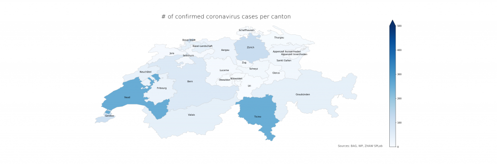
The following two figures compare absolute and relative case numbers (sometimes without the disclaimer that these are obviously known and/or confirmed cases only). Much of the current media attention is on the “Southern cantons” Ticino and Vaud due to high absolutes. When taking population density into account, Ticino becomes worse, Vaud less so, and Basel is evidently on the worse side as well. Valais, another “Southern canton”, does not stand out in either, making a pure geolocation-centric hypothesis less likely.
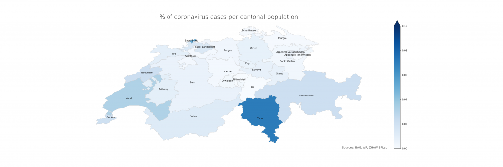
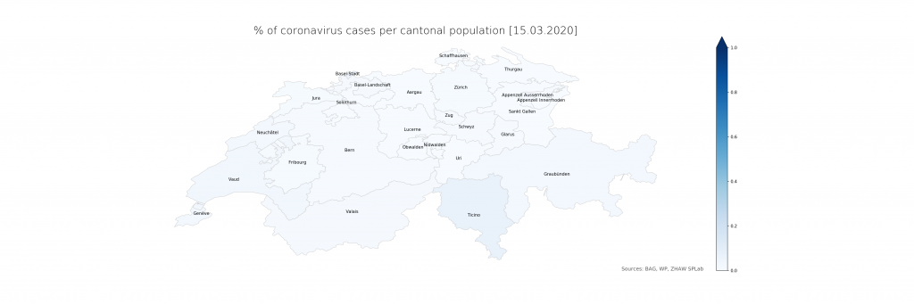
The numbers show that in Ticino, around 0.07% of the population is currently affected (or, potentially, had been – the inclusion of deaths is not explicit in the BAG numbers). The scales have been chosen consciously to highlight the distribution differences. On a more intuitive scale, even just reaching 1% and the corresponding cantonal population of 500’000 (leaving just Bern and Zurich above), the maps look a lot less frightening:
Evidently, there is a lot of power in how the maps are presented which calls for detailed studies. From a data science perspective, it is just clear that raw data, ideally as a convenient service with augmented representations, should be provided first and foremost from authoritative sources. The service would have to be stateful, updating numbers on a daily schedule instead of per request and in an automated way using web scraping until declarative data formats become available. The map representation could drill down to lower administrative areas (see however the lack of Zurich cases in detail), strengthening the geoinformatics perspective needed to resonate better with the population and hence increasing the societal impact.
Here are the map sources:
import pandas as pd
import numpy as np
import geopandas as gpd
import matplotlib.pyplot as plt
import datetime
import os
fp = "data/CHE_adm1.shp"
map_df = gpd.read_file(fp)
cantons_df = pd.read_csv("cantons.csv")
merged_df = map_df.merge(cantons_df, how="left", left_on="NAME_1", right_on="CANTON")
def plotmap(df, datacol, vmax, filename, title):
sm = plt.cm.ScalarMappable(cmap='Blues', norm=plt.Normalize(vmin=0, vmax=vmax))
fig, ax = plt.subplots(1, figsize=(30, 10))
ax.axis("off")
ax.set_title(title, fontdict={'fontsize': '25', 'fontweight' : '3'})
ax.annotate("Sources: BAG, WP, ZHAW SPLab", xy=(0.68, 0.11),
xycoords='figure fraction', fontsize=12, color='#555555')
sm.set_array([])
fig.colorbar(sm, ax=ax, extend="max")
df['coords'] = df['geometry'].apply(lambda x: x.representative_point().coords[:])
df['coords'] = [coords[0] for coords in df['coords']]
for idx, row in df.iterrows():
plt.annotate(s=row['NAME_1'], xy=row['coords'],horizontalalignment='center') df.plot(column=datacol, cmap='Blues', linewidth=0.8, ax=ax, edgecolor='0.8', vmax=vmax)
fig.savefig(filename, dpi=150)
merged_df["VIRUSCASESDENSITY"] = 100 * merged_df["VIRUSCASESCONFIRMED"] / merged_df["INHABITANTS"]
print(merged_df[["ACR", "VIRUSCASESDENSITY"]])
if not os.path.isfile("map_absolute.png"):
plotmap(merged_df, "VIRUSCASESCONFIRMED", 500, "map_absolute.png", "# of confirmed coronavirus cases per canton")
plotmap(merged_df, "VIRUSCASESDENSITY", 0.1, "map_density.png", "% of coronavirus cases per cantonal population")
os.makedirs("dailymaps", exist_ok=True)
stamp = datetime.datetime.now().strftime("%Y%m%d")
hdate = datetime.datetime.now().strftime("%d.%m.%Y")
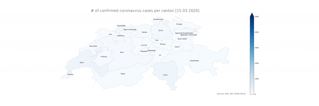
plotmap(merged_df, "VIRUSCASESCONFIRMED", 5000, f"dailymaps/map_abs_{stamp}.png", f"# of confirmed coronavirus cases per canton [{hdate}]")
plotmap(merged_df, "VIRUSCASESDENSITY", 1, f"dailymaps/map_den_{stamp}.png", f"% of coronavirus cases per cantonal population [{hdate}]")
CANTON,ACR,INHABITANTS,VIRUSCASESCONFIRMED
Aargau,AG,677387,26
Appenzell Innerrhoden,AI,16145,0
Appenzell Ausserrhoden,AR,55234,3
Bern,BE,1034977,69
Basel-Landschaft,BL,288132,41
Basel-Stadt,BS,194766,100
Fribourg,FR,318714,31
Genève,GE,499480,103
Glarus,GL,40403,3
Graubünden,GR,198379,43
Jura,JU,73419,7
Lucerne,LU,409557,9
Neuchâtel,NE,176850,38
Nidwalden,NW,43223,0
Obwalden,OW,37841,1
Sankt Gallen,SG,507697,16
Schaffhausen,SH,81991,1
Solothurn,SO,273194,6
Schwyz,SZ,159165,12
Thurgau,TG,276472,4
Ticino,TI,353343,250
Uri,UR,36433,0
Vaud,VD,799145,254
Valais,VS,343955,43
Zug,ZG,126837,8
Zürich,ZH,1520968,119
shoud be:
merged_df = map_df.merge(cantons_df, how=”left”, left_on=”NAME_1″, right_on=”CANTON”)
not:
… ight_on=”CANTON”)
nice to add:
script to get actual ‘cantons.csv’
Thanks, typo fixed. How cantons.csv was produced manually: Taking the numbers from https://de.wikipedia.org/wiki/Kanton_(Schweiz)#Liste_der_Schweizer_Kantone_mit_ihren_Eckdaten and a bit of post-processing: removing the digit dividers (‘) of the numbers, adjusting the canton names to the local conventions (e.g. Fribourg instead of Freiburg). An automated retrieval, especially when drilling down further into districts (using CHE_adm2.shp), could work with this data: https://www.bfs.admin.ch/bfs/de/home/statistiken/bevoelkerung/stand-entwicklung/bevoelkerung.assetdetail.9635941.html
Btw. in the df.plot line where it says vmax=vmax, it helps setting vmin=0 to get the full colour scale. This was detected in another geospatial visualisation derived from that one, that will soon appear in a blog post on its own.